Procure Smart are a brand new B2B service switching provider with a smart future. It’s brand voice is more reminiscent of a comparison website than a utilities broker, with language like “switch smarter” and “get smart” alluding to the business’ tech related ambitions.
Procure Smart needs a logo that not only represents what they offer, a smart service switching experience, but also their tech related ambitions with a fully digital user experience.
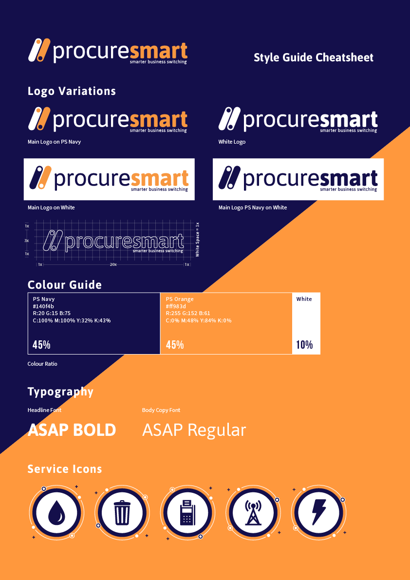
The icon is based upon the toggle switch from common digital user interfaces. It represents switching an old service provider off and a new service provider on. The slanted angle of the double switch and the lowercase lettering also represents the form of a URL i.e. https://procuresmart.com.
There’s two key elements to consider when choosing any brand colours;
Aesthetics
Emotions
With all of the above in mind, I chose navy to be the primary colour as it’s traditionally associated with finance, professionalism and trustworthiness. For the secondary colour, I narrowed it down to orange and green, and here’s why;
Accessibility: Both colours provide a good contrast to the navy and earn AAA rating on the WCAG Accessibility Criteria.
Compatibility: Both colours are of a similar distance to navy on the colour wheel, meaning both colours compliment navy well. However, the orange provides more vibrance.
Meaning: Orange is culturally associated with low cost, budget brands and is also known for its energy and creativity. Green is associated with health, nature and eco-friendly causes.
Orange and green both work well as secondary colours and either would provide a strong brand identity. However, due to the fact that orange’s characteristics are more in line with Procure Smart’s i.e. low cost, energetic, ambitious, I would choose orange as the secondary colour to the primary colour navy.
Maybe green could be used in the future if the company ever decided to focus on switching to renewable energy solutions.
For a more in-depth look, download the presentation I created for the CEO and senior stakeholders…
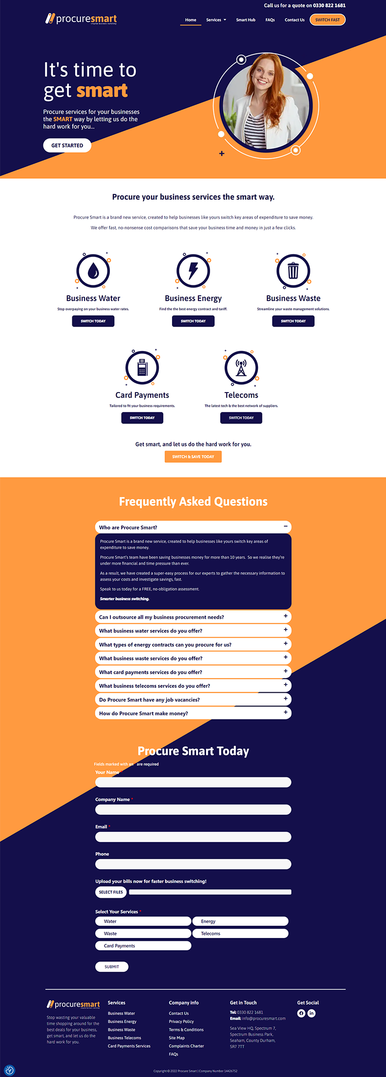
Of course no job would be complete without an online presence, and I was tasked with creating a brand new website with the branding I created in mind. This is just the start for Procure Smart as they have ambitions to create an online pricing tool and become the ‘Moneysupermarket’ of the B2B world. Go and take a look at the Procure Smart website.
As a nice little extra, I was tasked with creating a short video to explain the process to potential new customers. With no budget I had to use stock video footage, a stock soundtrack and animated typography, as a result, the video is simple and upbeat and answered the brief perfectly.
“Nobody knows everything, but everybody knows something, so let’s get together and share what we know.”