Fashion World
Web Design
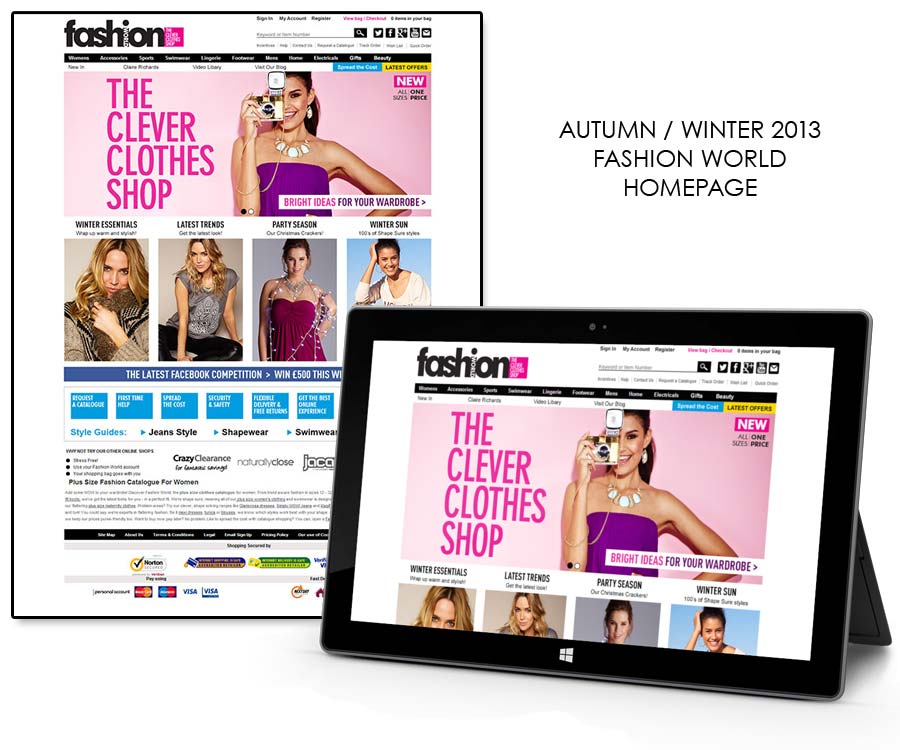
When I joined JD Williams in January 2013 one of my first major tasks was to redesign the Fashion World e-commerce website for the Autumn / Winter 2013 season.
In the Fashion World brand pack it describes how Fashion World is a down-to-earth, straight talking, no nonsense brand. I wanted to reflect this within the design philosophy for the new website. I did this by going for a flat design approach, which meant stripping out any skeuomorphic elements such as drop shadows, gradients, bevels and rounded corners etc. Everything had to be strong, straight and simple with flat colours.
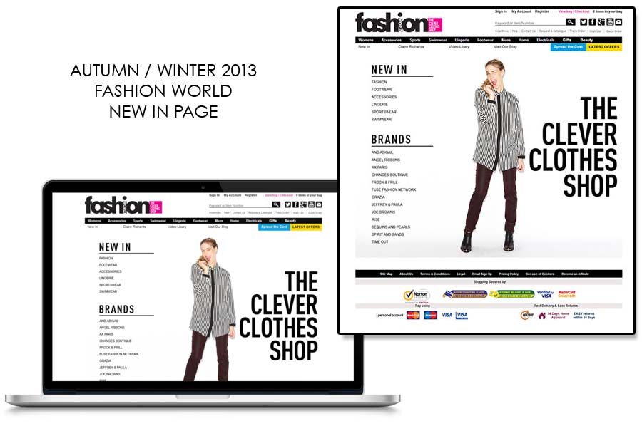
Fashion World had updated it’s brand with the introduction of “The Clever Clothes Shop” identity, and we had to include many new elements and marketing messages provided in a new graphics pack created by Red C Marketing Agency. There was a new colour scheme to put in place; pink = fashion, blue = services, red = sale and yellow & black = amazing value. For the first time in the website’s history we introduced web fonts, the font chosen for headers was DIN Condensed Bold and for the body copy we kept it simple and stuck with Arial.
There were a few changes I wanted to make but a lot of research and experimenting was needed due to the fact that the Fashion World website shares a template with all the other JD Williams’ brand websites (Jacamo, Simply Be, Marisota etc.) so I had to be careful that any changes I made didn’t effect the other websites.
I wanted to add social icons to the header to make them more prominent and really push social media for the brand, but in order to this I had to make some room. I did so by simplifying the search box. The old website had an input field, a category drop down menu and then the search button (in that order from left to right). After doing some research I discovered that less than 10% of visitors used the drop down menu and that the third most popular search term was nothing (blank) which meant people were just pressing the search button hoping for something to happen without entering a keyword or phrase. So I removed the drop down menu and united the input field and search button making it clear that it’s one, simple search tool. This made some extra room for the social icons and I made them stand out by adding some CSS3 transitions.
Some of my favourite pages include the Delivery & Returns page, I know it sounds boring and previously it was boring, it was just a page full of text with a grey background. Using a bit of jQuery I broke the information up into two clear sections making it easier to digest and added a lifestyle shot to add a bit of character. I also liked the following Free Format pages; The Leggings Directory, Coloured Jeans and New In. In the past designers had free range with the free format pages so they had the tendency to be a bit random. I wanted bring in a bit of consistency by making the headers of the free formats all the same size, font and style with social share buttons always in the top right and any navigational buttons and call to actions near the top of the page. Then whatever happens below in the main content area is up to the designer.
Take a look at the new Fashion World website and let me know what you think.

